CLIENT / MCAP

MY ROLE / VISUAL DESIGN

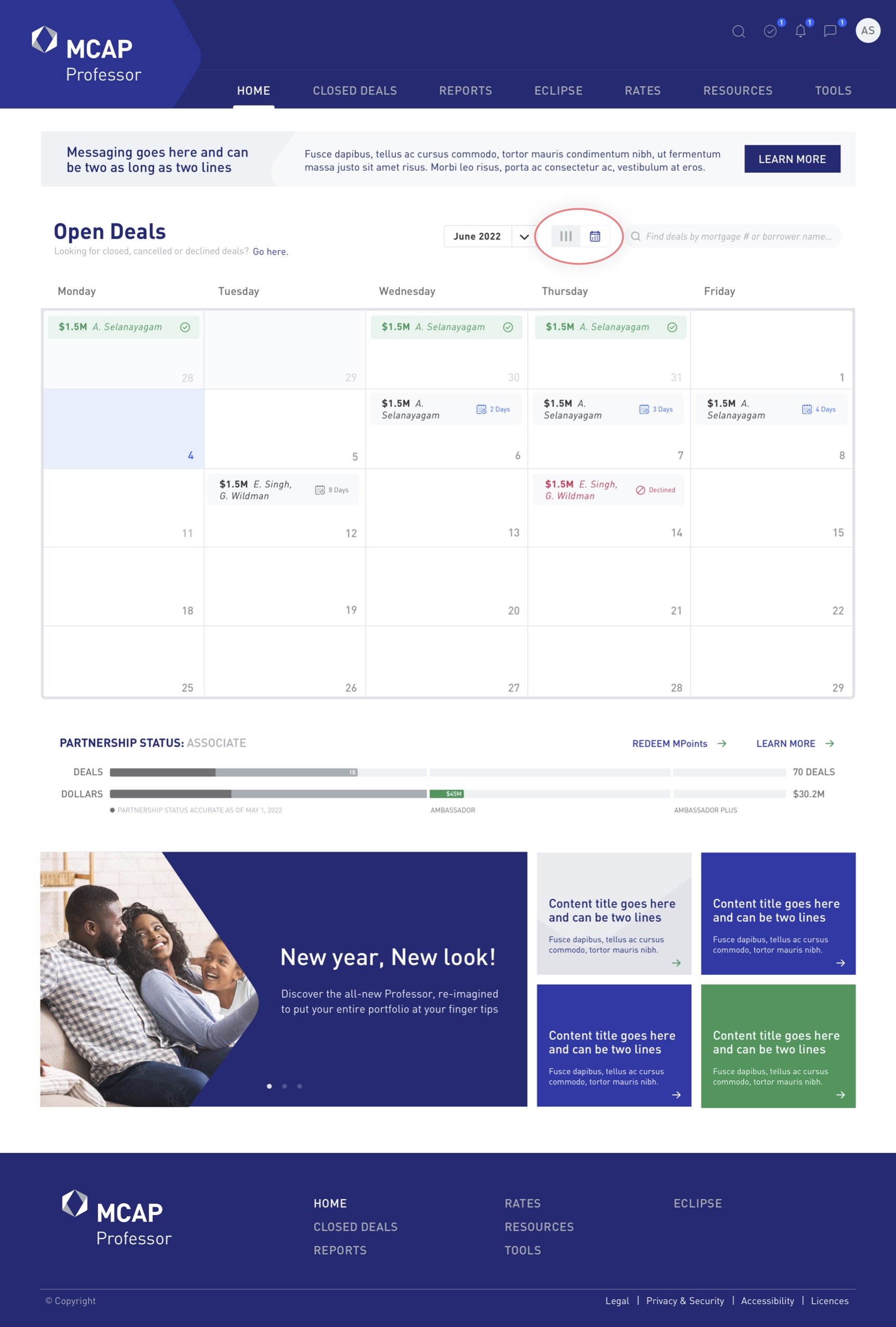
SUMMARY / I lead the redesign of the broker portal for Canada’s largest independent mortgage financing company: MCAP.

MCAP offers mortgage solutions for Canadian homeowners, investors and brokers. Their online portal was specifically created for brokers and underwriters to manage their sales pipeline against their targets.

Unfortunately, the portal had not been updated in over 15 years and was a pain point for their employees. The primary ask was to have the portal updated to be more user friendly, seamless and modern. As well as have the user interface embody the essence of the MCAP brand.

PROBLEM STATEMENT

As part of the re-design, MCAP wanted to ensure the new portal had a strong visual connection to their brand. In order to ensure brand consistency, I incorporated their colour scheme and visual references to their hex graphic throughout the design.

MCAP WEBSITE CURRENT BRANDING

Included below are examples of the old broker portal design. Images are limited to what can be permitted to display to the public.

PREVIOUS DESIGN 

On the Homepage, brokers can easily view all deals and their status across a clean timeline, borrowing design elements from a Kan Ban project management workflow. Deal statuses were organized by their stage in the MCAP sales lifecycle, and presented in a clean and efficient format. 

HOMEPAGE

This allows brokers to view deal status in two formats: calendar view - by deadline, or status view - by sales lifecycle.

COLUMN / CALENDAR TOGGLE 

A ‘quick view’ feature that allows users to efficiently preview a more detailed summary of the status of a deal. Whilst, also providing the option to access the full ‘deal details’.

DEALS QUICKVIEW

This page provides the most comprehensive summary of a broker's deal details. To make it less overwhelming, I incorporated iconography to highlight key deal elements, and a horizontal progress bar so users can gather key information at a glance. The sidebar also features stakeholders details and support resources, in a clean environment without overcrowding the page.

OPEN DEALS

The reporting dashboard allows brokers to visualize data about their deals across a variety of different dimensions. For this page I designed dashboard widgets at the top to highlight performance, and used coloured icons as a visual cue to summarize deal status. In addition to adding reporting and filter toggles so users can easily organize and export their data. 

REPORTS

Previously a list of items in an excel sheet, brokers found this format to be very tedious and difficult to find relevant documents that they were searching for, as the list had no clear visible hierarchy of resources.

BROKER RESOURCE & LEARNING HUBS

The new design has a sub navigation that users can click into, and the page automatically scrolls down to the relevant section, making for easy navigation whilst maintaining clear resource hierarchy at the top of the page.

RESOURCE HUB

The learning hub features an array of content from videos to case studies, with each section split out with a clear subhead. The top navigation includes a summary of learning resources, with links to jump to relevant content hubs, for ease of navigation.

For this design we focused on prioritizing accessibility, whilst still maintaining modules to promote featured learning paths.

LEARNING HUB

Click on the image below to view the prototype in Figma

FINAL PROTOTYPE

Next Project